Delta Auto is making buying a car online be as easy as ordering a pizza
Role
UI/UX DesignerYear
2021Contribution
Overview
I had one mission: to take the stress and confusion out of buying a car online. Let's face it, choosing a car should be as easy as picking out your dinner online, without the usual eye-tiring interfaces. So, I strapped in, ready to turn this ambitious idea into a user-friendly reality at one of the largest car dealerships in Finland.
Process
Research and Prototyping
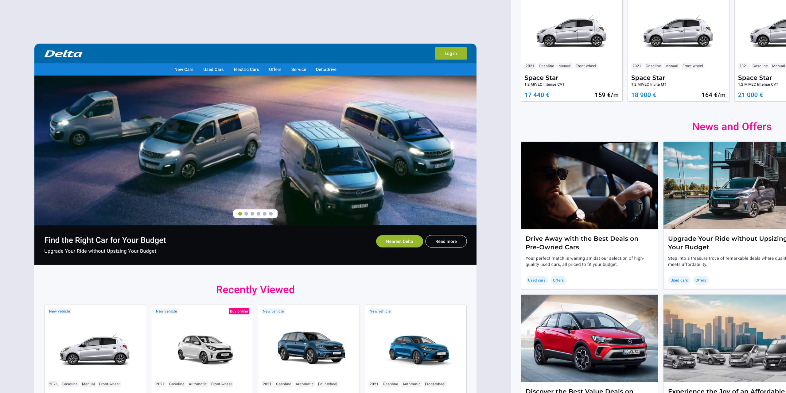
The initial step was grounded in comprehensive research to understand the existing gaps in the market. I was committed to breaking down the complex process of choosing a car into a user-friendly experience.
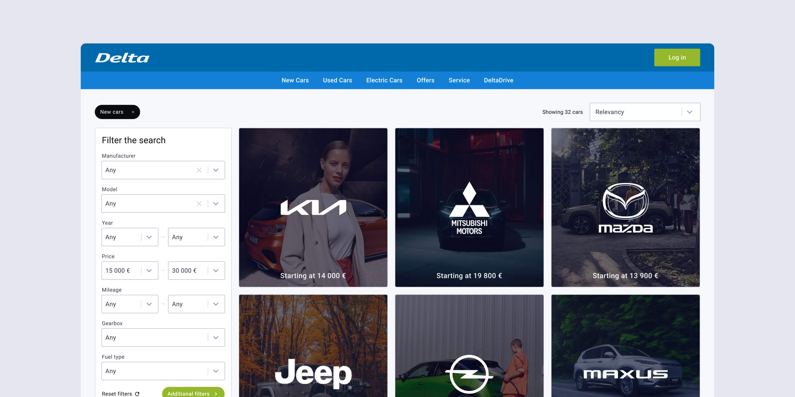
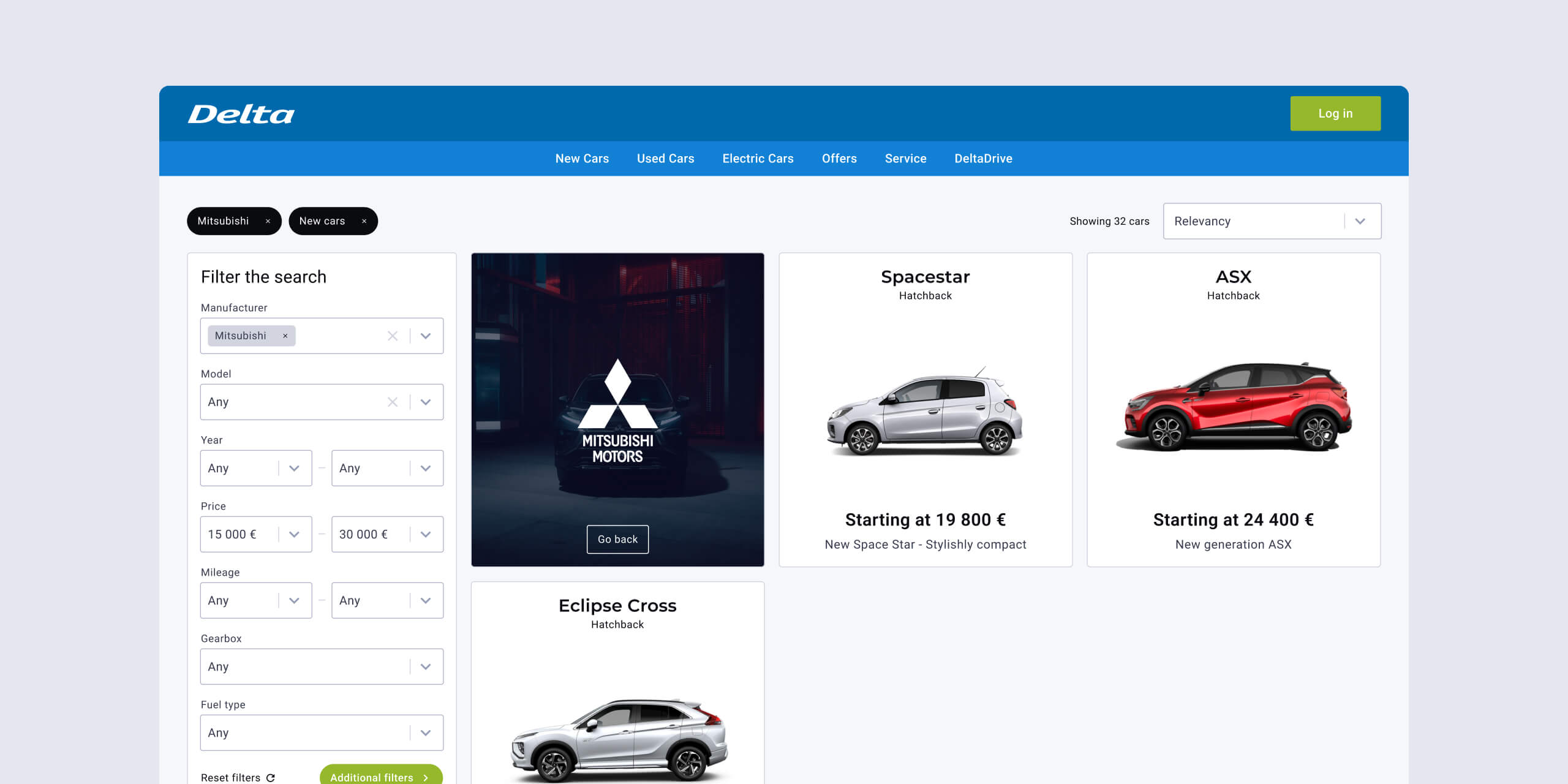
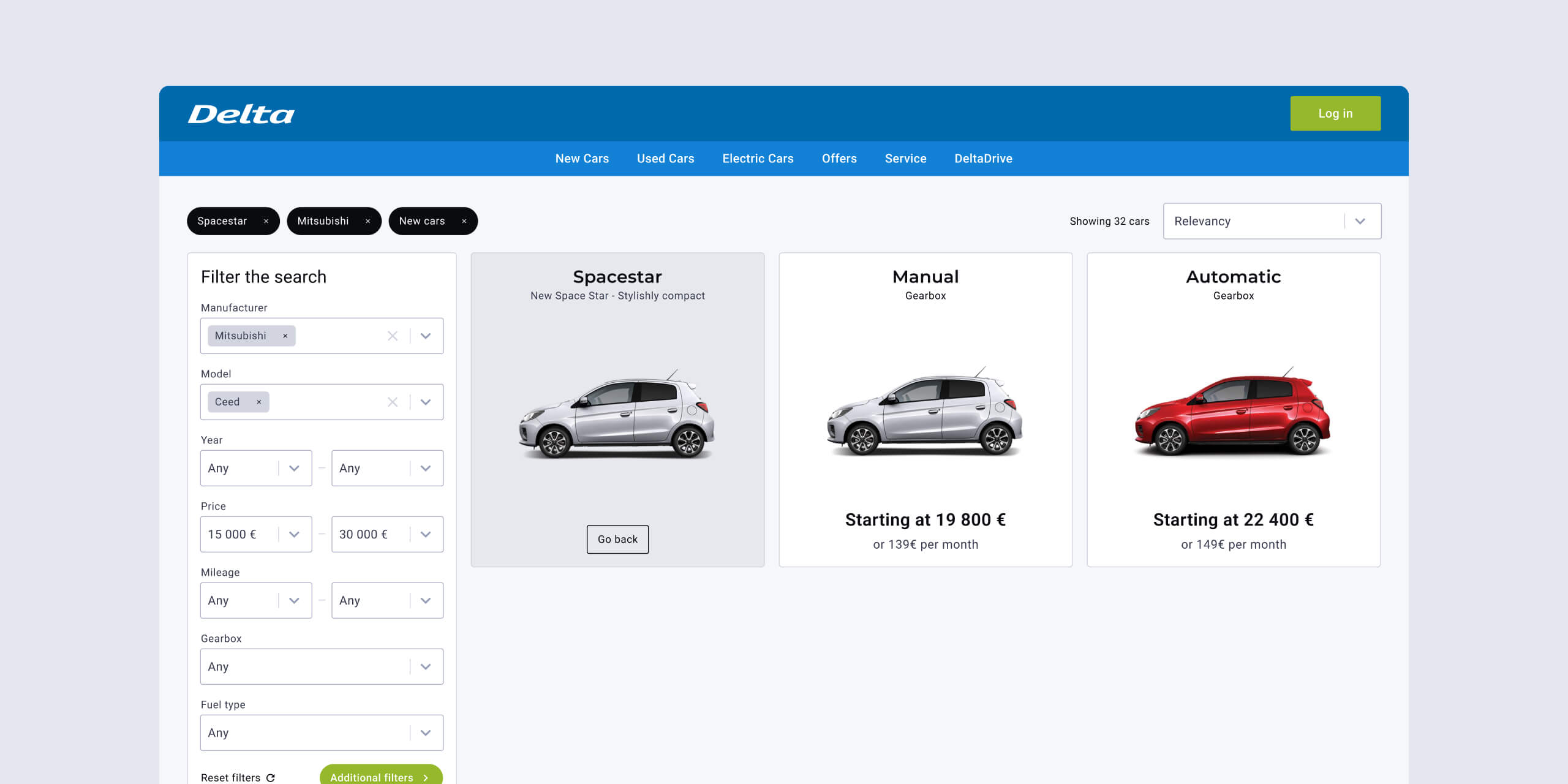
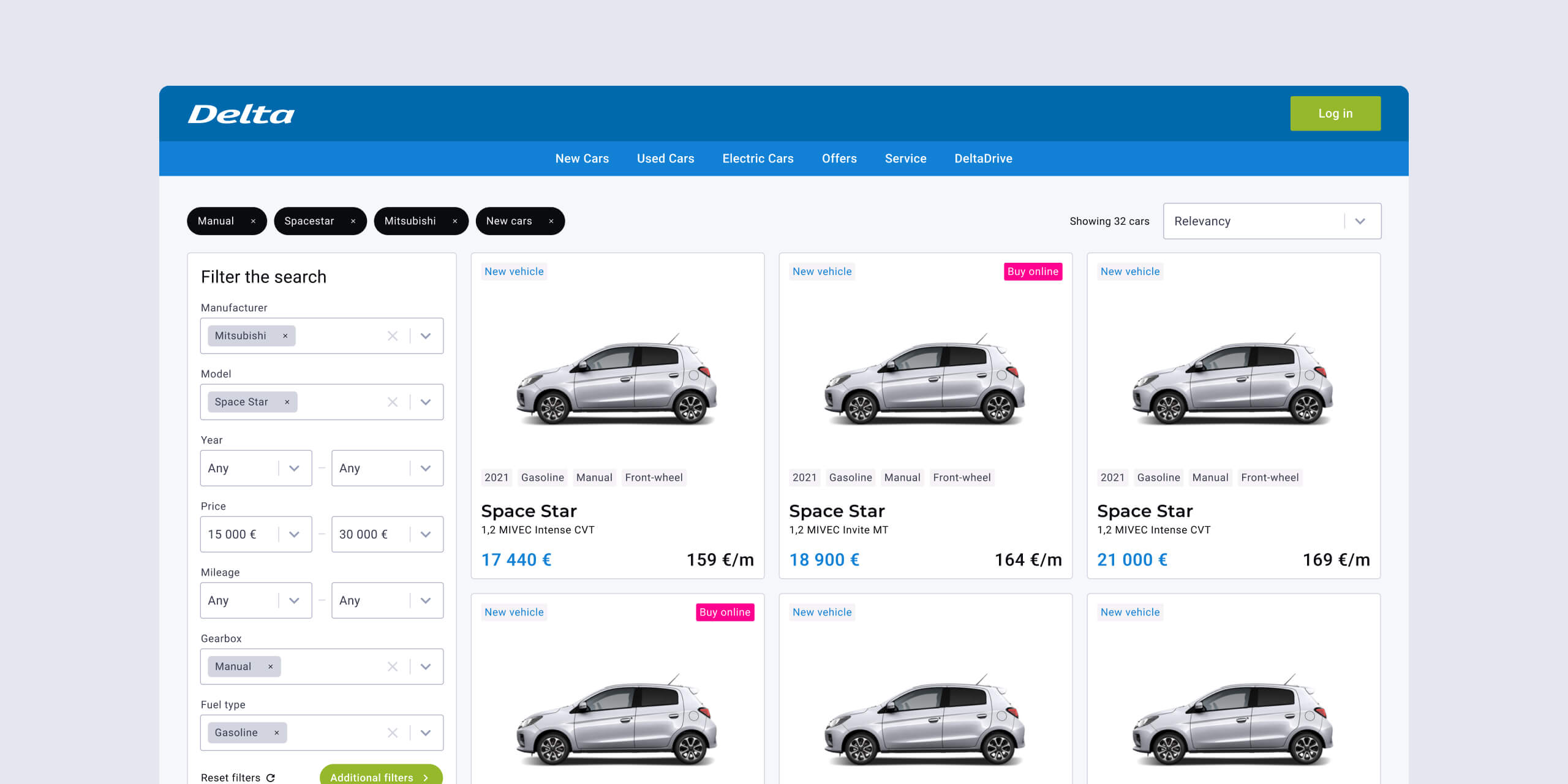
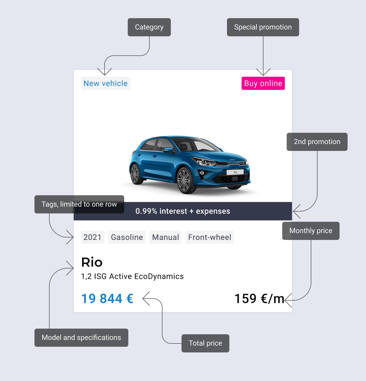
Developing prototypes, experimenting with different layouts, and tirelessly iterating were part and parcel of this stage. A significant focus was placed on crafting product cards that could give users a quick yet comprehensive view of the vehicle details, balancing both aesthetics and functionality.
Design System
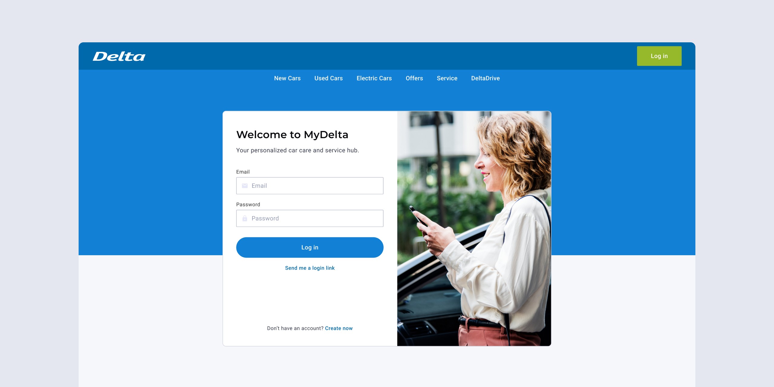
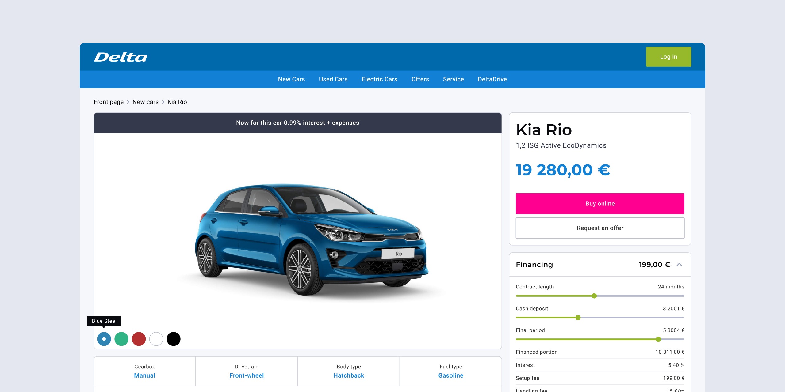
As the sole designer, I took up the task of building a cohesive design system from the ground up. This involved creating an interface that would seamlessly integrate Delta's varied product offerings, including DeltaDrive, MyDelta, and DeltaCare. The goal was to create a synergy between these products, facilitating a user experience that was intuitive and unified, ultimately driving sales across all platforms.
A Tale of Endless Tweaks
Gathering feedback and continuously tweaking the design based on user insights ensured that the platform was not only modern but genuinely user-centric. This phase involved numerous iterations, testing what resonates with the users, and discarding what doesn't, to create a platform that truly meets their needs.
Challenges
Developing Intuitive Sorting and Filtering Options
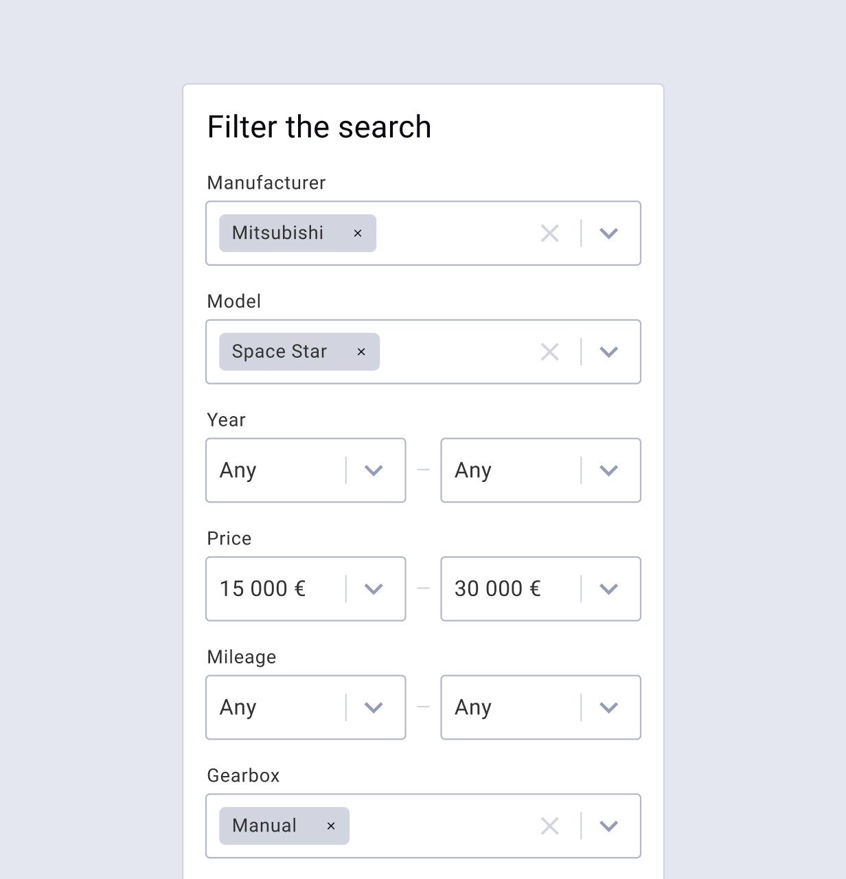
Choosing a car involves considering various factors, and providing users with intuitive sorting and filtering options was essential. The goal here was to develop a system that would allow users to easily narrow down their choices based on their preferences without getting frustrated by complex and unintuitive sorting options, a common pitfall in many existing platforms.
Achievements
Simplified Interface
One of the crowning achievements of this project was the creation of a clean, simplistic website that focused on what's essential, taking away the stress and complexity traditionally associated with choosing a car online. The refined UI emphasized ease of navigation, making the task of selecting a car feel less daunting and more enjoyable for the average person.
Product Cards that Get You
I'm pretty proud of the vehicle cards we whipped up. They're not just informative; they give users exactly what they want at a quick glance. Whether it's spotting new deals or identifying the perfect car with the right features, these cards are like your friendly neighborhood dealer, without the sales pitch.
A Seamless Journey
Navigating through Delta's services is now a breeze. Users can hop from choosing a car to sorting their maintenance plans without feeling lost. It's a cohesive, intuitive, and frankly, a much more pleasant online journey for all our users.